The changing face of business software
Date: 3 October 2019
The changing face of business software. An illustration of some great improvements in software interface over time.
A client recently contacted us to ask about updating from a 20-year old Qudos software application. It had been purchased on CD media, installed on their server, and used ever since. Unfortunately, it was (not surprisingly) no longer going to be compatible with a new server they were getting. We were, of course, delighted to move them onto the latest cloud version. Before making the transition, they very kindly sent us some screen shots from their original product. We found it fascinating as most of us had never seen that original interface or had long forgotten what it looked like. The screenshots illustrated the changing face of business software over that time. It prompted us to put together this very brief narrative.


Beginnings - Quality Manager Database (Qudos 1)
Circa 1999-2000
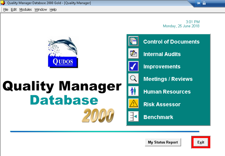
We probably thought the interface looked cool at the time, but let’s be honest, when looking back from 20 years later it does look a bit blocky and antiquated. In our defence, that dark green colour (Teal) was actually popular at the time! There wasn't the infinite choice of colours available that we have now, and you were lucky if your monitor had 800x600 resolution. In fact, it was only a few years before this that PCs had no real graphics rendering capability at all. Yes, it was just text.
OK. Excuses out of the way. It definitely got much better going forward!
Qudos 2 and the Windows XP look
Circa 2003
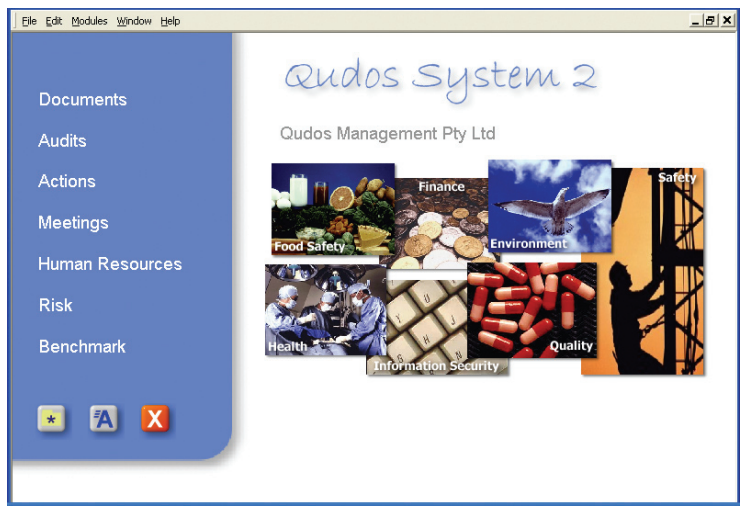
In the early 2000’s, the database technology had changed to Microsoft SQL which offered a far superior solution for larger installations. There was also a big leap forward for the interface with a more photographic look, fresh colours, soft corners, graduated shadows, and friendlier fonts. The photographs reinforced the broadening scope from quality to include topics such as health and safety, environmental, and information security management.
A blue base colour was used. The colour scheme was very much in line with the Windows XP look that was in vogue with software developers at that time.

The XP-era styling was very popular and our current ‘Aqua’ theme (available from the Quicklinks menu) still has echoes of some of these colours.
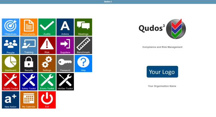
Qudos 3 and the smartphone / tablet styling influence
Circa 2008
The Qudos 3 interface was ‘browser-based’ and did not require an application on a client computer. This enabled it to be used over the internet on a range of devices. We had already started our cloud service by then.
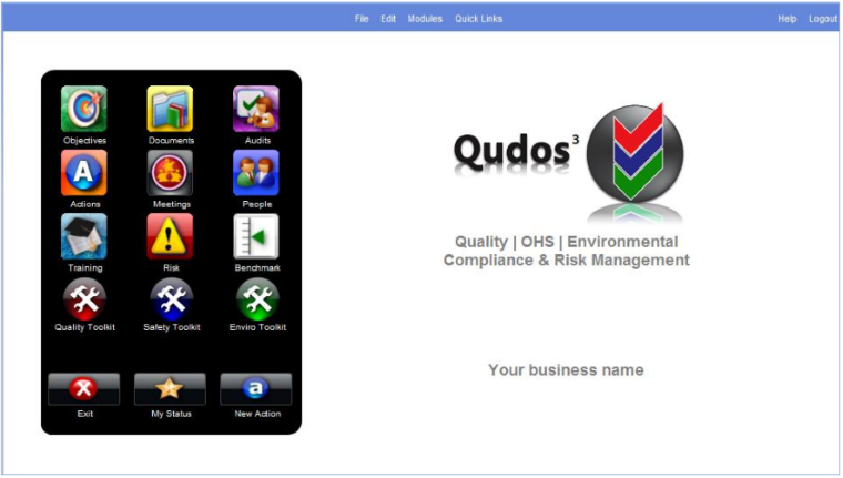
By the late noughties, smartphones and tablets started to appear and our interface was influenced by their styling. Images on buttons etc started to become a lot more sophisticated. Their background had the appearance of curved glass with lighting effects. The icons themselves were more detailed and sometimes even rendered at an angle with shadows to give a 3D appearance.
Some images (like the Qudos 3 product logo above) developed a reflection. This was known as the wet-floor look.
This level of detail was made possible by the rapidly growing processor power and screen resolutions that was becoming available on user’s computers at that time.
Keeping it simple
2015 to date
In the previous 15 years, software interfaces had evolved from text and simple illustrations to much more intricate renderings. However, fashion never stands still. Last year’s style is always so…last year.
Instead of becoming ever-more detailed, the trend in recent years has been towards a simpler and fresher look.
A few years ago, we dropped the reflections and shadows etc. and introduced a clean white background.
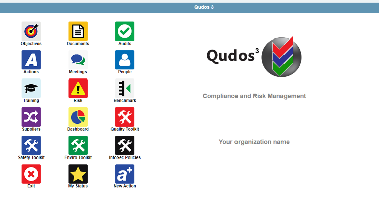
...but customisable
At this time, we also introduced resolution-sensitivity. That meant the display automatically adapted to the resolution available on your device. Personalised settings for column display and record numbers were also introduced, along with a choice of themes for colour and font sizes.
The latest versions of Qudos 3 brought an even cleaner look. There are larger buttons - all with white icon images and integrated text. We brought in additional buttons for features that were previously only available on menus e.g. for changing a password or getting Help. At the same time, a facility was provided for clients to add their own logo.
The interface seems to be universally popular with users, and yes – we think it looks cool. However, we have no doubt that in 20 years’ time, people will look back and smile at the style – just as we now do for our original design. There will be certainly be further changes in the future. We can only wonder what they will be. Anyone for Teal?